Dec 27, 2006

Target Prescription Labels


I recently filled a prescription, and experienced firsthand Target's much-touted new prescription labels. Although I am only a test case of one, and not in the high-risk group, my personal experience confirmed the design's expectations. I found relevant information easier and faster to read and understand, and found it easier to pick out the right meds from a crowded cabinet.


Misdosing and mismedicating are common and preventable personal healthcare problem. This is especially true for people with impaired memory or judgement, and with people with multiple caregivers or impared caregivers. There are various time-alarm pill dispensers available for home use, but I don't remember ever seeing studies or observations of their real effectiveness.

Dec 17, 2006

Not Learning From Your Mistakes

A previous post noted how the Denver Post misspelled Donald Rumsfeld's name on the front page of the Sunday edition. Today they misspelled the name of Qwest Corp on the front page of the business section. Qwest is one of the largest employers in the area, and frequently featured in both the business section and the general news sections.

A couple of observations:
  • It's clear that over-reliance on spell-checking software led to both errors. Both resulted in a valid English word used in an obviously inappropriate and incorrect way, but in a way that should be fairly obvious via human QA.
  • You would think that after the initial error, the editorial group would be very sensitive to this type of error.
  • It also seems like the Post's email triage is no better than that of most organizations. I had emailed the Post to alert them of the original mistake, but the only response was that - due to their editorial policy - they could not publish my comment unless I provided my full address and phone number. I still wonder if my email ever made it to anyone who could actually impact editorial quality.

Lessons learned:

  • Automated QA tools can supplement, but often not replace, human QA. So you can do it yourself, or have your customers do it for you... often at the most embarrassing times.
  • Email is one of the preferred and most cost-effective methods of communication among your customer base. You should value and service incoming customer email with at least as much intensity as you do communication via other channels.

Dec 15, 2006

A Series of Unfortunate Events

On Dec 16 1960, United flight 826 collided with TWA flight 266 over Staten Island, NY. Everyone on board the two planes (128 people) were killed, in addition to 6 people on the ground when flight 826 crashed into the neighborhood of Park Slope, Brooklyn. Like most disasters, it was not caused by a single catastrophic event, but by a series of events that compounded the situation:

  1. Radar service was terminated at 10:21am over New York, forcing the planes to switch to instrument positioning.
  2. One of the VOR receivers on 826 malfunctioned, forcing pilots to rapidly use mental calculations for positioning and navigation.
  3. Traffic control provided an emergency diversion, revising its flight pattern, shortening its course and shortening its clearance.
  4. The crew miscalculated its clearance, bringing 826 into 266's path.

What can be learned? I won't address aviation-related issues, and will instead leave that to the experts. However, as with most catastrophic events, from Chernobyl to Three Mile Island, it was the result of a series of events that compounded to create and exponentially greater problem. A good lesson for those of us with less life-and-death occupations.

Dec 12, 2006

Design on a dime...

er quarter... er dollar..oh never mind...

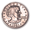
The first Susan B Anthony Dollar entered circulation Dec 14 1978. Somewhere along the way, basic design requirements were either ignored or not fully understood.

Its resounding failure stemmed from the fact that in size, color and edge texture it was so indistinguishable from the quarter-dollar. The design originally called for it to be not round, but hendacagonal (11-sided). It is claimed that due protests from vending machine manufacturers, the design of the edges were changed back to round with a reeded edge, without other design changes to compensate.

Dec 6, 2006

The permanence of print

The Denver Post misspelled Donald Rumsfeld's name...
...in the Sunday edition...
...on a sub-headline....
...on the front page above the fold.


No corrections or explanations yet.
You can see many more newspaper QC errors at:

RegretTheError.com
Learning how the media gathers, writes, edits and distributes its stories can be as scary as learning how sausages are made.

Art is made to be used

The Denver Post recently published an article describing the ill effects felt by visitors to the Denver Art Museum's unusual architecture. Apparently the architect agreed with the quote that "art is made to disturb." The unusual angles of the walls, ceilings, and - yes - staircases cause congitive confusion within a physical 3D space, causing dizzynes and other forms of physical discomfort.

The architect believes he deserves credit for building something so unique. But what is so unique about a work that drives its intended audience away? A peice of software with this building's usability would be properly criticized. An outdoor statue that melts at the first rain is useless, no matter how creative the sculpture. And a book printed with white letters on white paper is useless, no matter how brilliant the storyline. And I'm sure that public buildings that cause physical discomfort and loss of balance by those with inner ear disorders violate access laws.

I can't define art. But I know bad art when I see it.